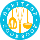
About a year ago, my sister Laurence and I started taking a more active role in our mom’s business, and realized it was time for a major facelift. The program was almost eight years old, and in techie language, that’s like a century! The overall look of the site didn’t feel quite right either- we wanted something more feminine, a little softer.
This is where we started:

We needed to come up with something that hinted at family, cooking, and books. Not easy!
I went to an old friend of mine, Philina, whom I had worked with while I was in magazines, and who had branched out with her husband to start a web design company (studiob.ca).
This was their first attempt:

We liked it, but that brown color was really throwing us off. The pot in the middle was good, but a little heavy.
This came next:

Cute, but again, kind of old fashioned feeling.
We dropped the color thing for a while and worked on graphics:

Too modern.
That became this:

Now that we getting really close!!!
Then, while I was surfing the net, I came across this photo from a company called Indigo. I loved the palette, and so brought that to our designers.

That’s how we ended up with this:

And finally:

Yay!!!
August 7, 2013 | Posted in:
Design A New Logo For Your Family Cookbook
No comment |
Post a Comment
